case study
CARAVANSERAI
identity refinement
website
photography
print media
social M. graphics
WM was initially approached for a website, when we proposed revisiting the brand identity to target younger audiences seeking ethnic accents within a modern setting. The colourful logo was pared down to only gray tones and type refinements.
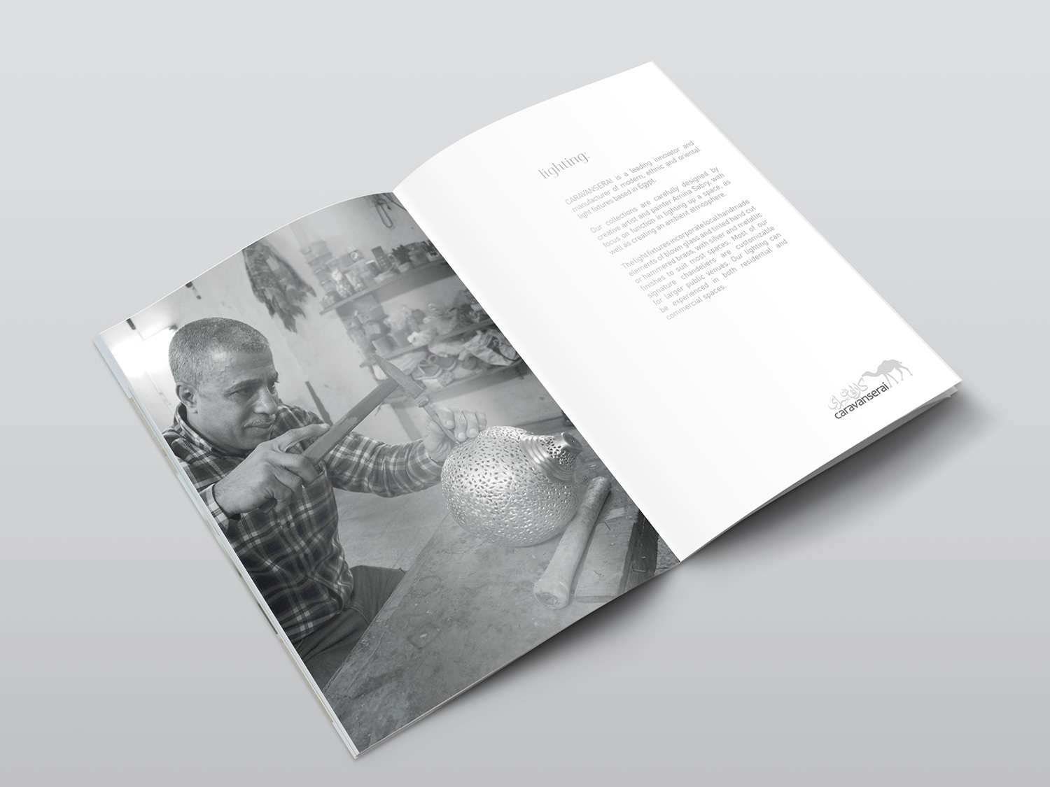
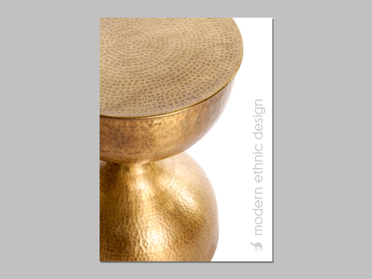
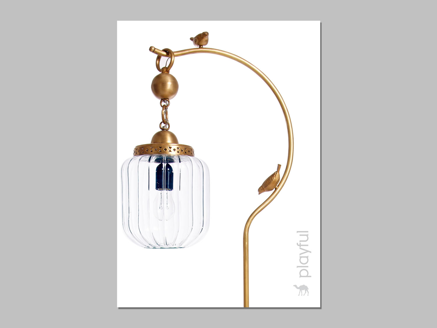
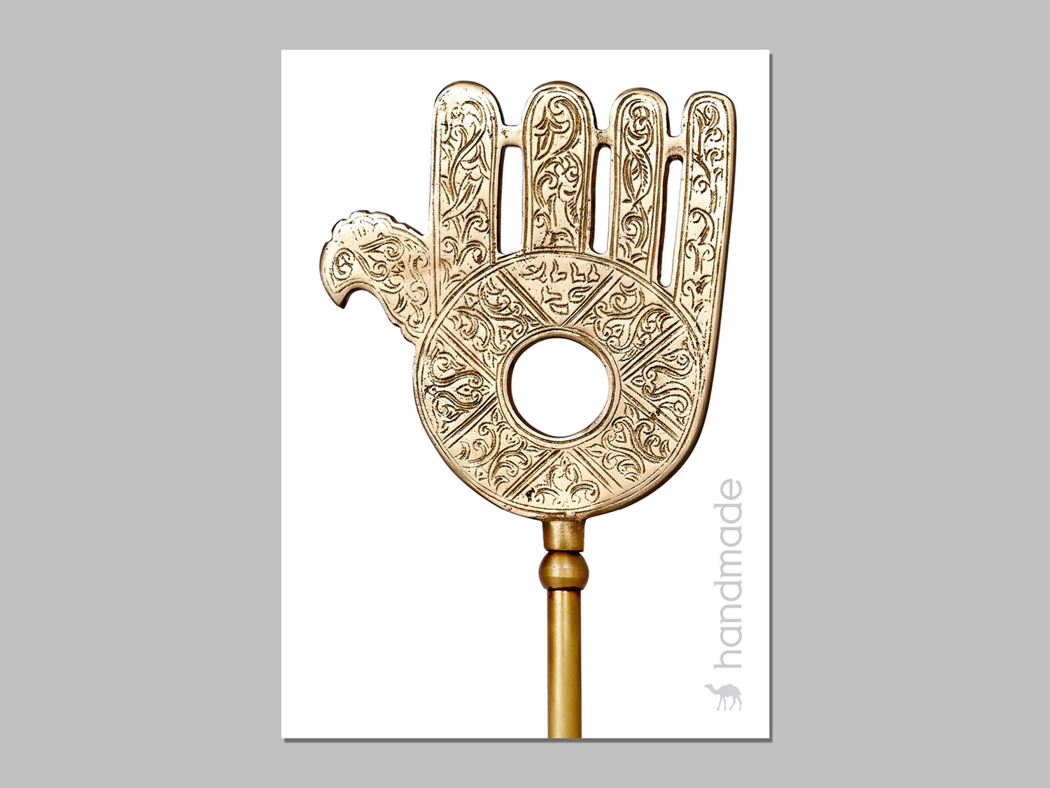
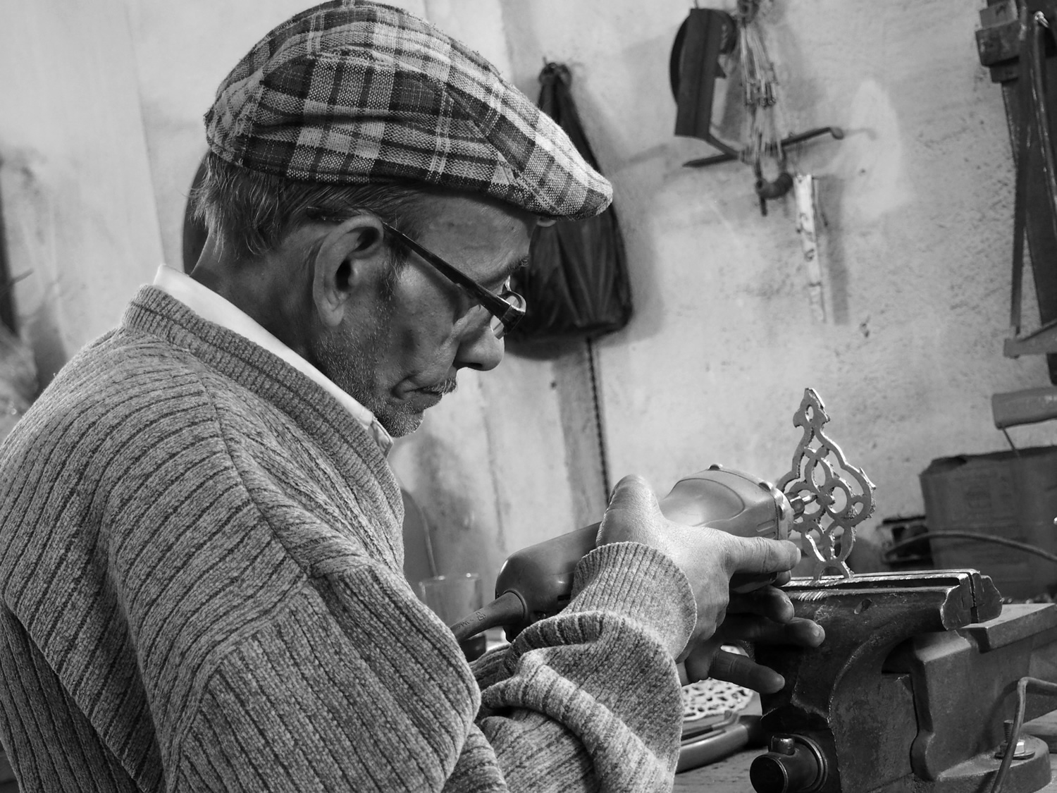
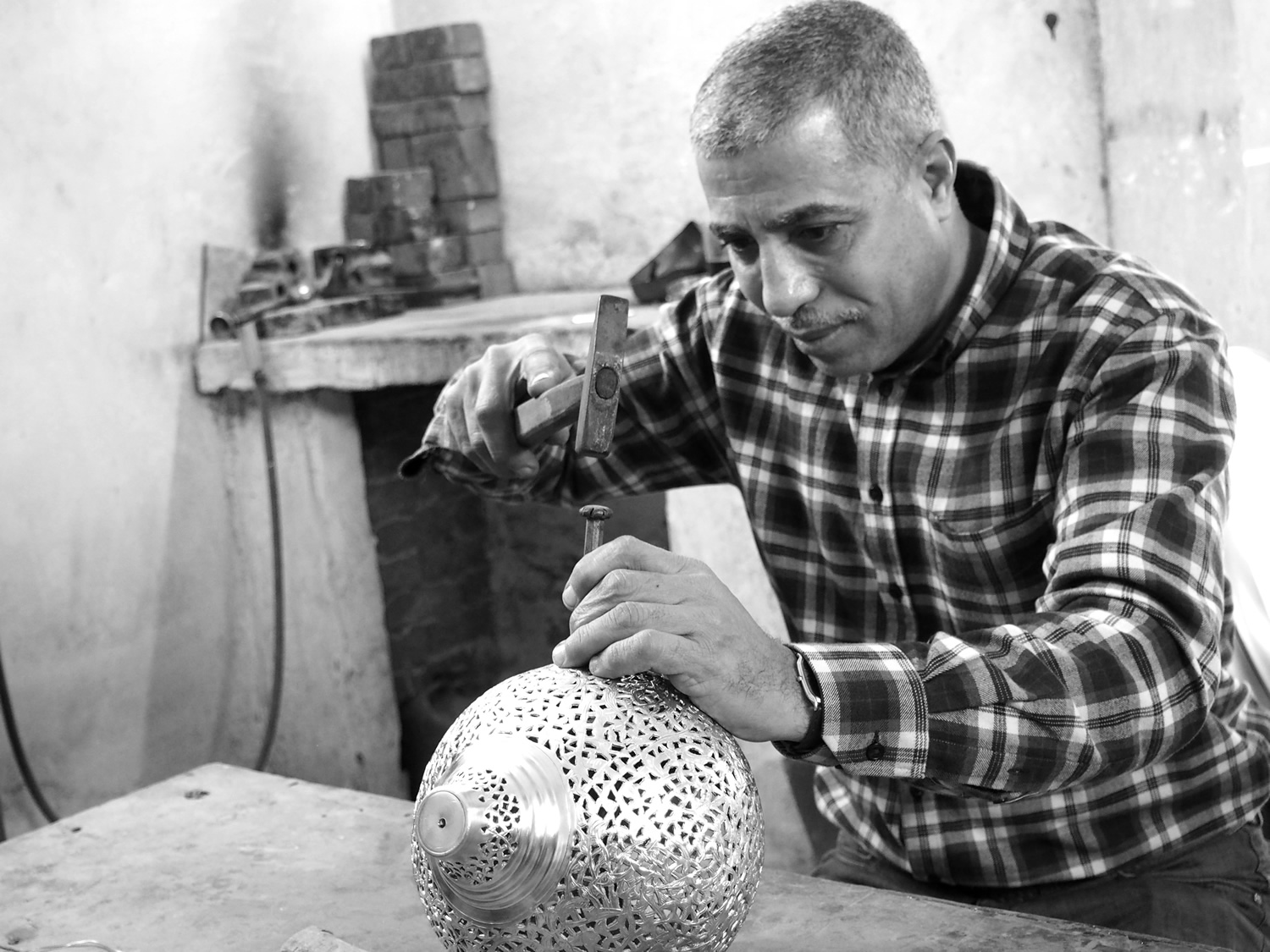
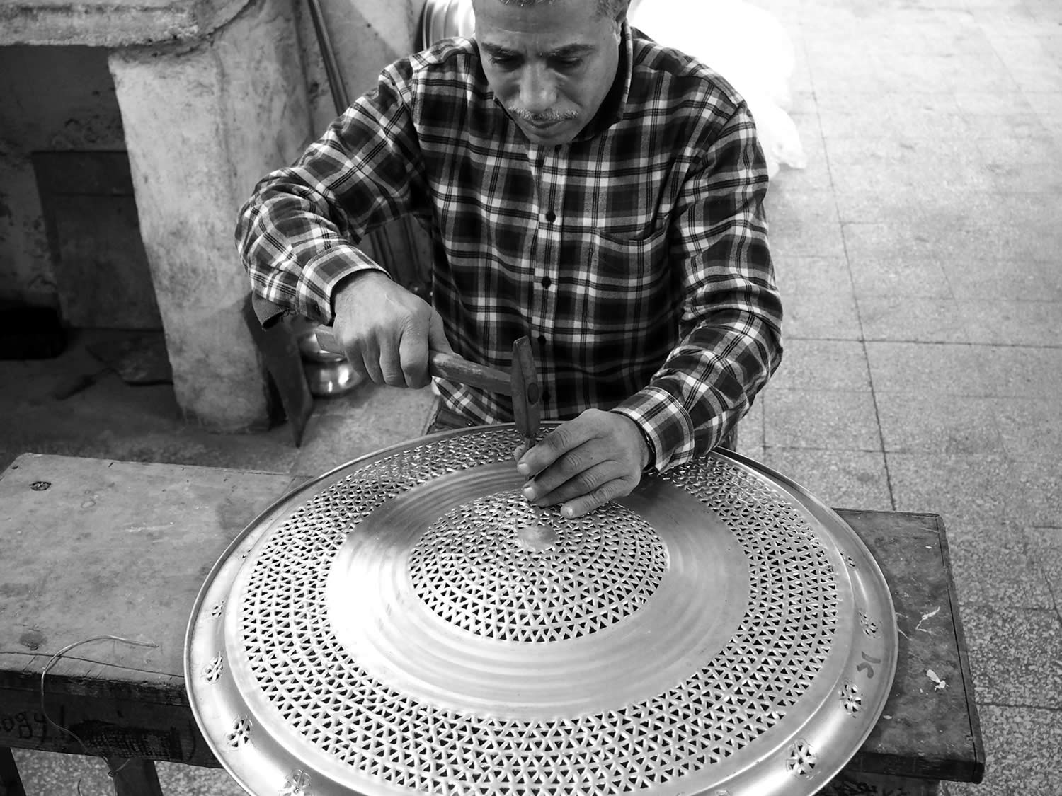
The result is a more contemporary luxury feel that still holds true to the brand’s oriental legacy. A positioning theme of [ collect . custom . create ] was created to reflect product engagement. Photography of the artisans at work helps humanise the brand.
logo refinement
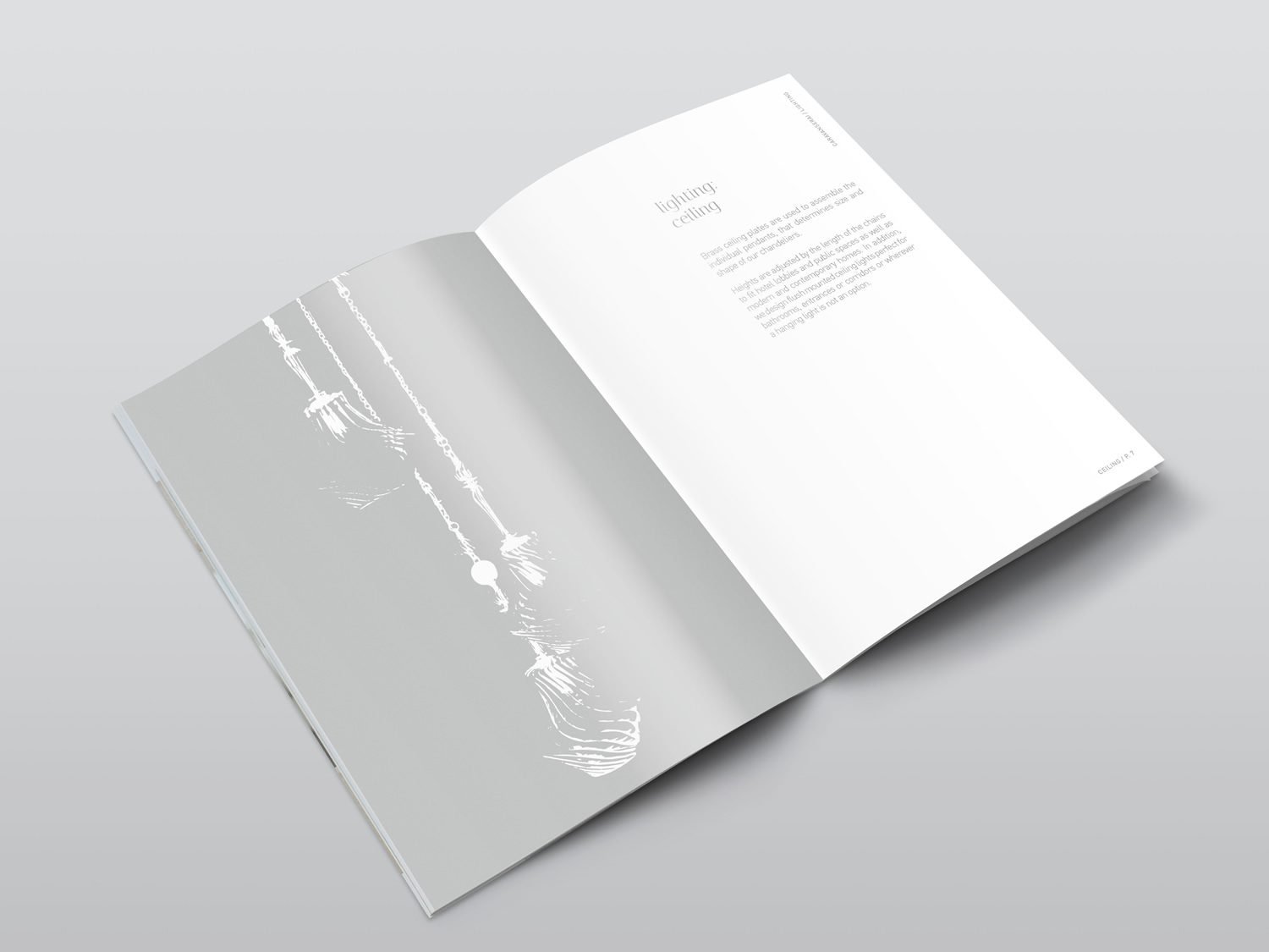
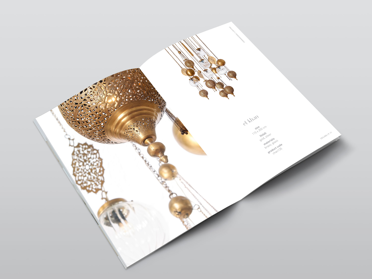
print - catalogue
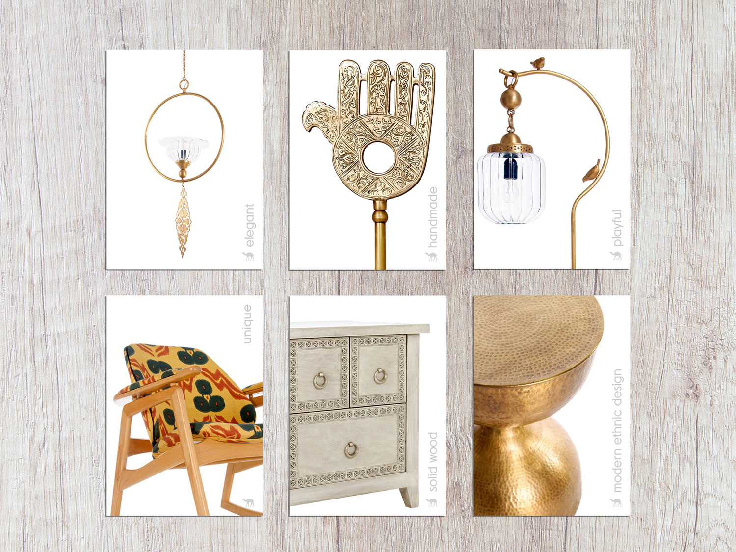
print - postcards
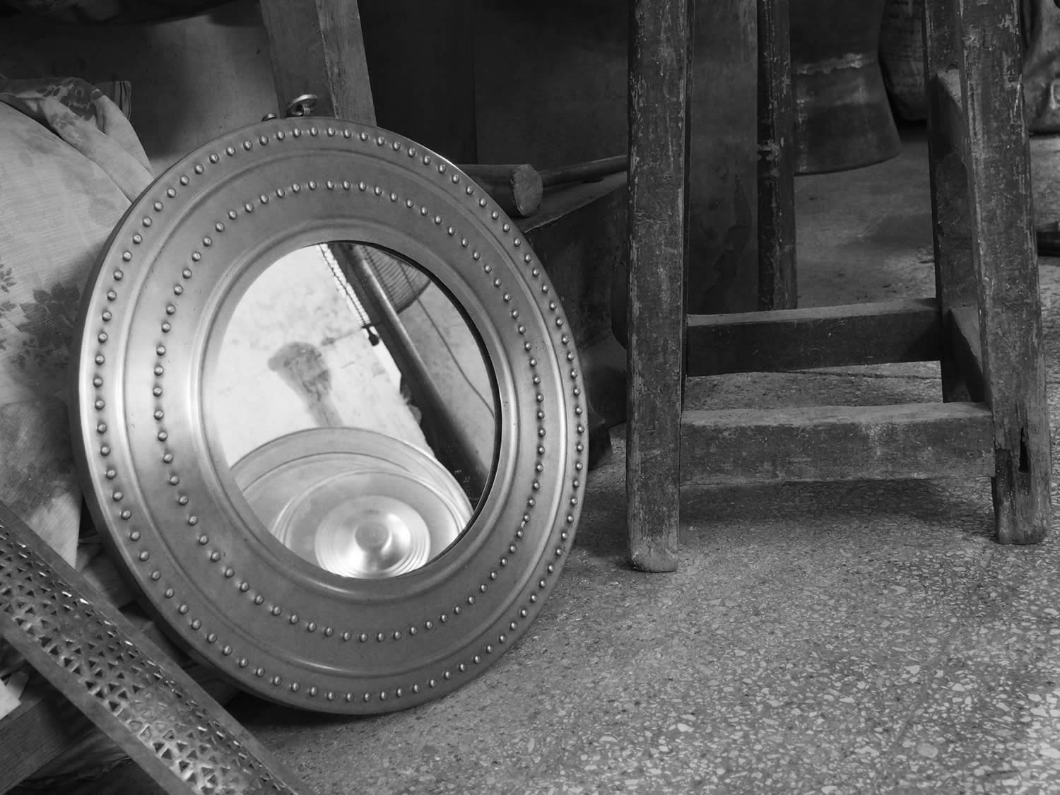
photography - image bank creation
website


